This week the work became louder.
Not louder in a messy way — louder in the sense of colour finding confidence, structure becoming graphic, and the map beginning to assert itself as an artwork rather than a reference.
Up until now, much of this project has been built through slowness: walking, tracing, reading old plans, testing Harris Tweeds, translating line into stitch. I’ve been interested in hesitation, in how a route softens once it passes through cloth. But these newest studies push in a different direction. They ask: what happens when the map stops whispering and starts performing?
The answer, it turns out, is colour.
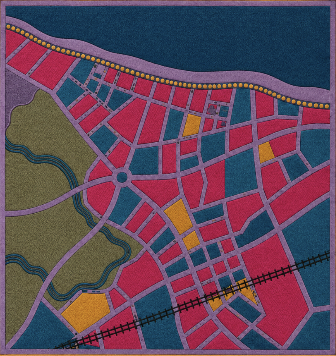
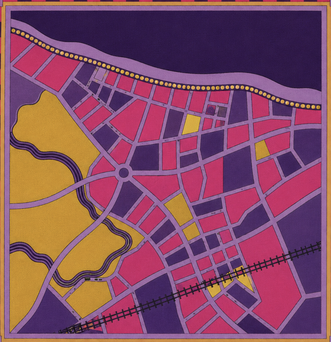
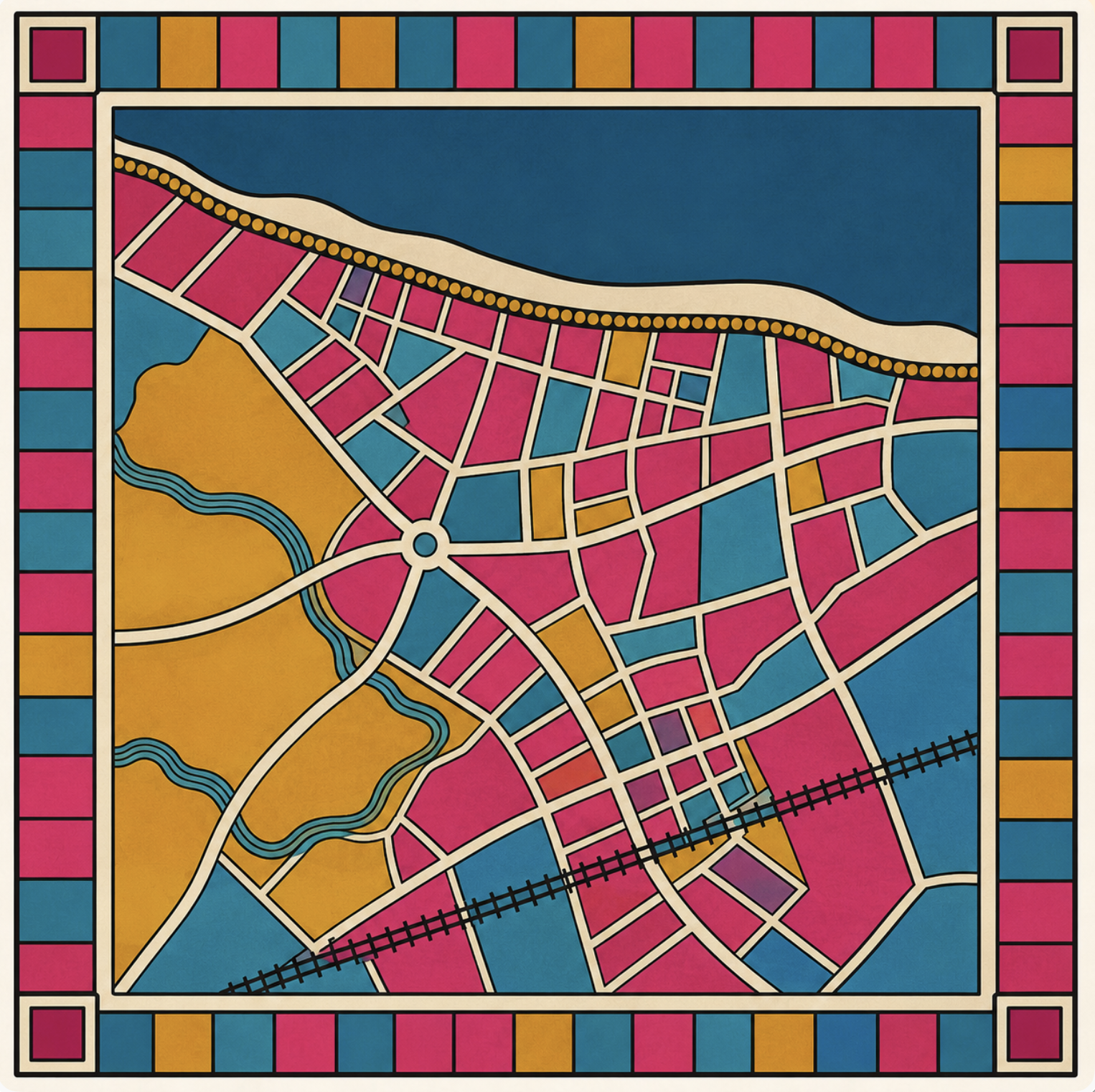
The Portobello composition has shifted into a much more graphic palette — hot pink, teal, yellow, dense blue, and violet. At first I thought this might move too far away from the Edinburgh/Portobello atmosphere I’ve been working with. But the more I sit with it, the more it makes sense. This isn’t about naturalistic colour. It’s about emphasis, rhythm, tension, and edge. It’s about allowing the map to behave like a contemporary textile object.
What I like in these images is the contrast between systems.
The black-and-white line drawing still holds the grammar of the place: coastline, railway, roundabout, street network, water. It’s the skeleton. But once colour enters, the work begins to operate differently. Blocks become fields of pressure. Roads become ribbons. The railway becomes a sharp interruption. The border starts behaving like a woven frame, almost architectural in its own right.
One version feels bright and civic — open, legible, graphic. Another moves towards aubergine and plum, becoming moodier, duskier, more interior. Both are useful. One speaks in public; the other in evening.
And that seems important. A map is never just informational. It always carries an emotional weather.
I’m realising that this body of work may need to hold both ends of the spectrum: the quieter stitched cartographies on tweed, and these bolder, flatter, more declarative compositions. One is close to the body. The other is closer to poster, banner, signal. Together they open a more interesting territory.
What still matters, even in this more graphic language, is restraint. The strongest moments are not where everything is described, but where the composition allows a place to become abstract without becoming generic. Portobello remains in the coastline, in the particular angle of roads, in the pressure of the railway cutting across the lower part of the frame. It doesn’t need to be named. The structure carries it.
That feels like a breakthrough.
The map doesn’t always need to explain itself. Sometimes it needs to declare a rhythm, a set of intervals, a way of holding place through colour and form.